5 common Flutter App issues you might not know but you have in your app

I always seek a place to level up the team and improve project velocity. Flutter and Android Developer with over 7 years of experience.
The variety of smartphones, screen sizes, Android and iOS versions, and device settings make testing all of them almost impossible. With each new device and OS feature, the number of test cases keeps growing, making the time needed for testing and addressing some issues very time-consuming. This makes it easy to overlook something, and the consequences for some users can be critical. Here's a list of five such problems. Check if your application is vulnerable to them.
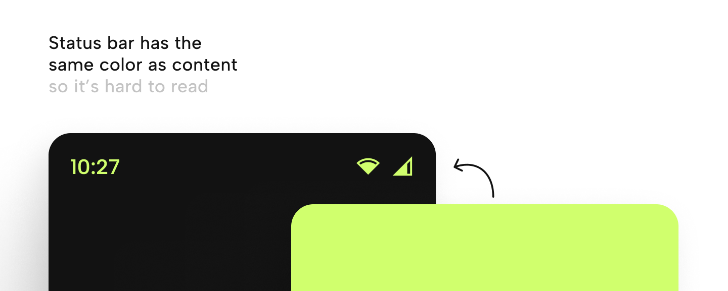
Ensuring status bar accessibility is very important because it gives users basic information without leaving the application. When the user puts the app in the background just to check what time it is now, or maybe the app is lagging because of a weak internet connection, we force the user to leave the app to check its internet, not the app - we just lose users. In some specific situations i.e. game apps, which you are supposed to play in landscape mode, it might be a good idea to put time, network status, and battery life somewhere else on the screen to ensure this is not the reason for leaving the app. Otherwise, make sure that it’s readable no matter of background color below the status bar.
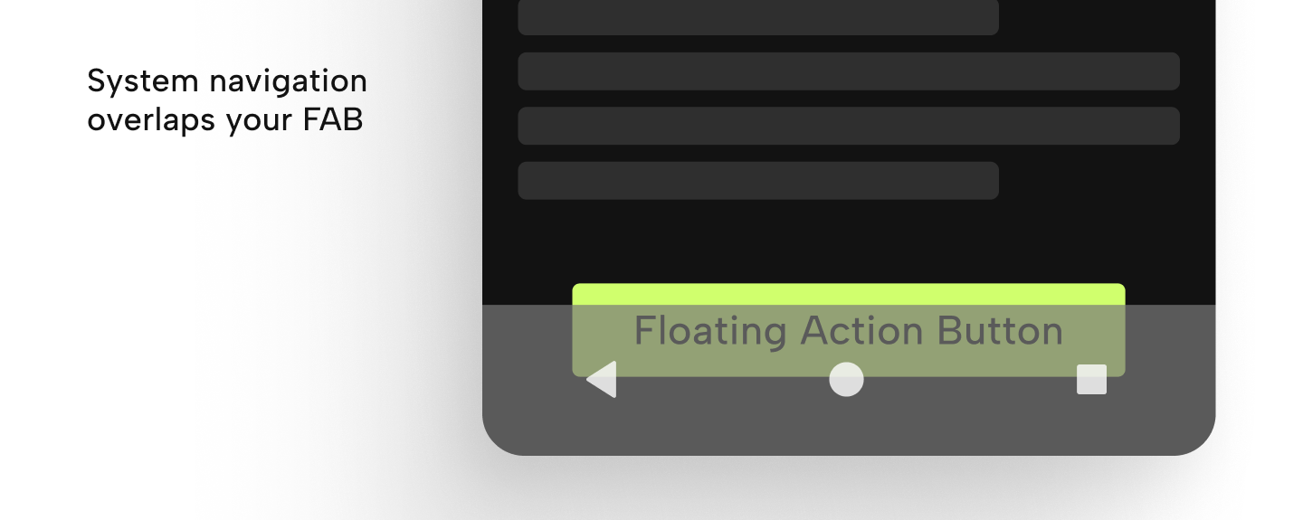
Using the Floating Action Button as a call-to-action is intuitive and easily reachable. It would be very inconvenient if something would stop or even block users from taking action. This can happen when we don’t consider screen insets while styling the content of the app, especially system navigation. Currently, we need to consider 4 types of system navigation:
- The bar: impacting iOS and newer Android versions, where the button may be partially covered by the navigation bar, slightly reducing its clickable area. This is the most common navigation type so most likely it will be covered.
- Software buttons: impacting most Android devices as enabling software navigation can be done in device settings and the most problematic as it adds the greatest insets to the screen. It’s very important to cover this case as it’s the only type of navigation on a few years-old Android versions.
- Gestures: Generally the safest option, as they add no insets to the screen.
- Physical buttons: As they are separate from the screen, they don't add any insets like gestures.
While covering the button is a worst-case scenario, a more common issue is the button becoming closely aligned with system navigation, impacting both the UI and UX of the app. This increases the risk of users accidentally minimizing the app, as the system home button is typically located in the middle. Many current apps incorporate bottom navigation within the app, which helps prevent such issues by separating action from system navigation. However, when users initiate specific feature flows, the app navigation is often hidden, so it’s important to ensure all the cases are across the app.
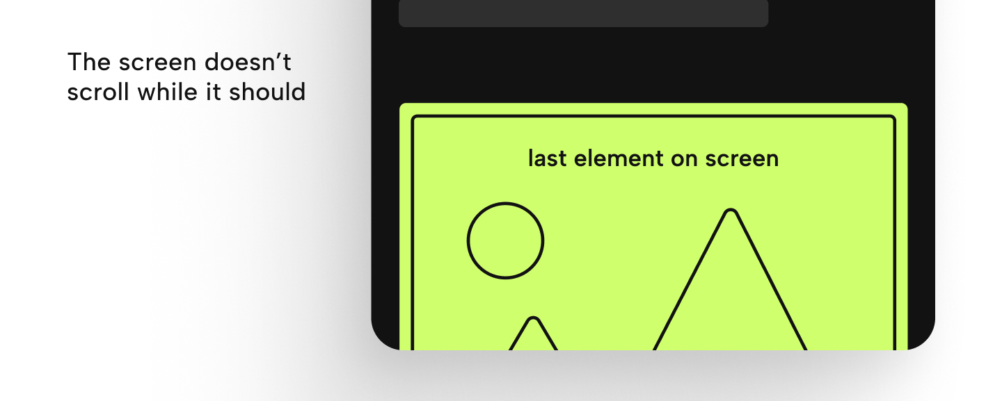
Sometimes the design of a screen may suggest that its content is fixed and won't scroll ever, taking half or three-quarters of the screen. However, this could pose usability challenges for users with devices with smaller screens or when there's a text input field on the screen, which triggers the keyboard to pop up. Such a scenario could hinder crucial user actions like logging in or proceeding with a checkout process or any action within the app. To prevent this, it’s a good practice to make sure that all screens are scrollable. Even if scrolling isn't necessary, allowing for it ensures flexibility. Don’t worry if the user starts scrolling the screen, upon releasing the drag gesture, elements should smoothly return to their initial positions.
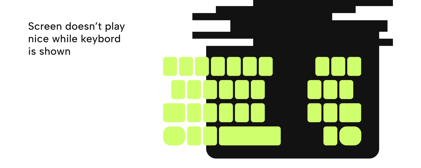
During development, it's often more convenient to utilize a device simulator or emulator for testing rather than a physical device. This enables the use of a physical keyboard for input within the app and allows for hiding the software keyboard. While this generally speeds up development, it's easy to overlook the importance of ensuring how the screen behaves when the software keyboard is displayed, particularly on devices with smaller screen sizes where the keyboard covers bigger portions of the screen. This can result in a poor user experience.
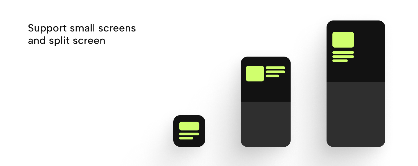
While split screen features or supporting small screens or even foldable devices might seem like edge cases, they don't necessarily have to be extreme scenarios. Using common sense, determining the minimum device size to support becomes challenging; sizes ranging from 4, 5, or 6 inches could all be reasonable. Any number can be the right answer because it all depends on what devices users use. The percentage of users we cut off or how many of them have poor UX is the number we should look at, even a 1% reduction in user accessibility can significantly impact conversion rates. Ultimately, well-implemented Flutter apps ensure responsiveness, addressing the aforementioned issues should make the app at least usable on smaller screens which might be good enough. However, supporting very small screens often requires additional measures beyond correct behavior and scalability. Sometimes, this involves adjusting UX or hiding unnecessary elements, similar to the practices employed in optimizing websites for both web and mobile platforms.
Summary
Addressing these issues typically involves implementing consistent logic across multiple screens, adjusting spacing, and modifying padding as needed. Furthermore, extensive testing is necessary across various devices with different sizes, operating systems and versions, and device settings (such as system navigation), consuming a lot of time and creating ample opportunities for oversight.
If any of those issues have ever arisen in your app and have been fixed where they occurred, it's very likely that more areas are vulnerable to it.
To mitigate these challenges, one approach is to create a comprehensive checklist to ensure all elements function correctly. However, this doesn't necessarily expedite the process. In response, we've developed a solution: a tool that streamlines these tasks, handling them automatically. This tool significantly accelerates our development process and takes the responsiveness of the apps we create to the next level.
Stay tuned for how to ensure that those issues don’t come up in your application! In the meantime, you can read about Golden Testing in Flutter.